

Bar charts for kids
What is a bar chart?
Bar charts show how much of something there is and can help you to make comparisons. They contain rectangles, or bars, of different sizes, making it easy to see how much of something there is and compare if a bar is bigger or smaller than the next. They are common and easy to read. You could use a bar chart to answer all kinds of interesting questions, like what’s the most popular sport in your class, or which crayon color you have the most of left.
Speaking of crayons, let’s use them to better understand bar charts!
How do you read a bar chart?
These are Daphne’s favorite crayons. They are different sizes because she uses some colors more than others. Can you spot which crayon is the biggest?

If you said purple, you’re right! Looking at Daphne’s crayons is just like reading a bar chart. A big bar means there is a lot of something. A short bar means there’s not that much. You can compare the heights (or lengths) of the bars within a graph, too.
Daphne shares more about bar graphs in the video below.


What types of bar charts are there?
There are several types of bar charts. Daphne explains them in the video above, or you can read about them below.


Vertical Bar Chart (also known as a Column Chart)
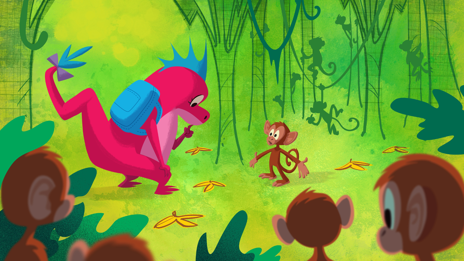
A vertical bar chart is the most common type of bar chart. The bars stand up tall like trees! Each bar shows how much or how many of something there is. The taller the bar, the more there is of that thing. For example, if you’re counting how many toys you have of each type, you could make a vertical bar chart to see which type has the most. In the jungle, the tallest bar led Daphne to the banana thief.
Horizontal Bar Chart
A horizontal bar chart is like a vertical bar chart, except that the bars go sideways instead of up. The longer the bar, the more there is of that thing. You could use a horizontal bar chart to show the different types of snacks you like, with the longest bar showing your favorite.
Stacked Bar Chart
In this type of bar chart, you take two or more bars and stack them on top of each other. This lets you see not just the total amount, but also how it’s made up of different parts. For example, if you’re counting how many fruits you ate this week, a stacked bar chart could show how many apples, bananas, and oranges you ate. Each type of fruit would be a different color in the same bar, so you can see the parts and the total at the same time. In outer space, Daphne used a stacked bar chart to show the aliens which spaceship had enough fuel to travel home.
How do you make a bar chart?
Practice drawing bar charts with the following downloadable instruction worksheet and activity.


What questions will you answer
by drawing data in a bar chart?


For more on bar charts, check out what is a bar chart? from the storytelling with data chart guide.
Learn about other types of graphs from Daphne the data-drawing dragon by clicking below!

